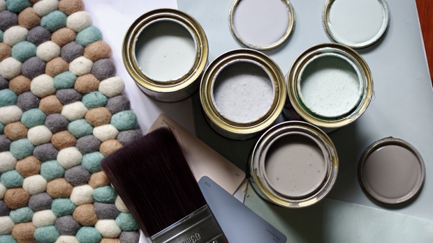
 The Scenario:
With the arrival of summer, and baby boy Remy it’s time to tackle a DIY painting project in our 1930s deco house. The walls in my sights? One bedroom, a new nursery, the living and dining spaces.
The Challenge:
To overcome a fear of using colour! Untouched for decades, the walls in our newly purchased home are in need of a serious hue makeover (pastel green is no longer dujour).
The Solution:
Get clued up on how colour could work best in our spaces by enlisting the expert help of Shaynna Blaze, interior designer, TV presenter and Taubmans Brand Ambassador. Apply painting tips gleaned from the professionals, and create looks worthy of an interior designer’s favourite pins. Infusing the rooms with a modern charm and sophisticated palette of blue-grey, I discover my creative skills translate well to create what we consider an elegant, modern and understated interior.
Top Takeaway:
1.Test test test! Hot tip: Use a virtual tool like the Taubmans Paint Your Room app. When in doubt about a colour, don’t limit yourself to small colour chips. Paint big sheets of cardboard and prop them up in the room in question. Observe how it looks at different times of the day. This gives you a better idea of what it’s going to look like.
2. Be brave – if you can’t make the leap start slowly with a lighter shade and when you are in love with it transition to a colour with extra depth. You can always go darker.
3. Follow the 10 Commandments of using colour.
4. Lighting – warm or cool lighting can dramatically change the feel of an interior. Choose warm lights for a comfortable and lived-in ambience. Consider if you need down lights vs. pendants or both? Pendants give character and additional design and visual thought; whilst down lights give great light coverage.
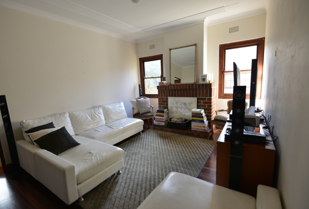
It’s time to reveal the ‘before’ and ‘after’ shots. I hope you enjoy having a look around my humble abode.
Living Room
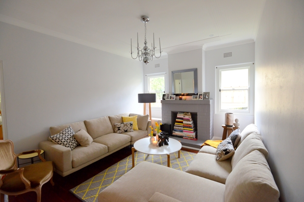
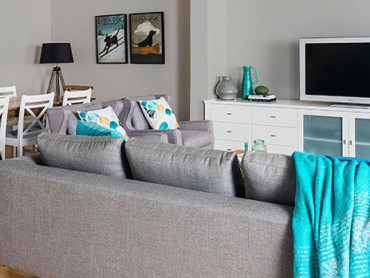
Metallic accents complement the warm grey palette we use throughout the house and in the living room we introduced a dramatic Bordeaux Chandelier in polished chrome. It took a while to source but we finally found the modern interpretation we wanted in Surry Hills design store Exhibit. 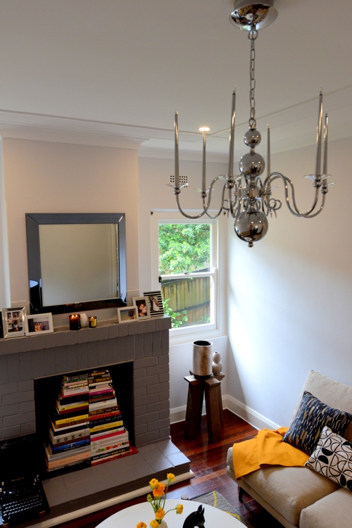
We used a few elements of black around the room to lend a sophisticated edge. The pops of yellow and mustard on the rug, cushions and throw breathe warmth and comfort into the space, and fresh blooms and candles tie it all together. In my home, the latter two always make an appearance not just for the visual appeal but for the feelings and memories you can evoke with different scents. Verbena always takes me back to the south of France.
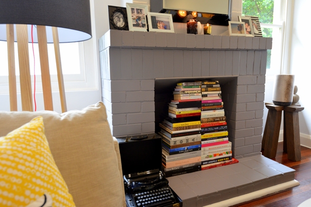
The large pile of coffee table books accumulated over the years have found a new home in the brick lined fireplace; painted the same colour as is used on two walls in the adjoining dining space.
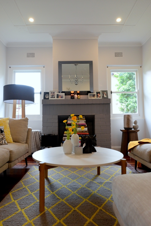 Wall colour: Taubmans Platonic White in Low Sheen.
Fireplace colour: Taubmans Antique Silver (exterior)
Windows, Doors and Trim colour: Taubmans Crisp White
Styling notes: Louis XIV Chair sourced from private estate auction, Bordeaux Chandelier and enamel side table by Exhibit, horse bookends Orson & Blake, Vintage Remington typewriter, photo frames from Wedgewood and West Elm, Cire Trudon and Glasshouse candles. See our Freedom Pinterest board for select pieces including sofa, cushions, rug, coffee table and floor lamp.
Wish list: Framed artwork on the walls – would love to hear your recommendations?
Dining Room
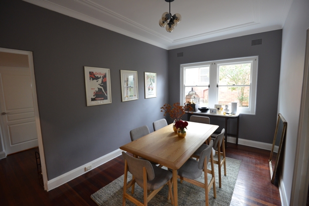
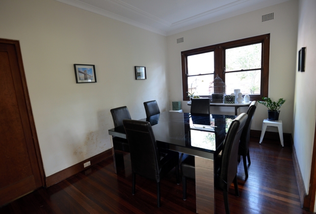
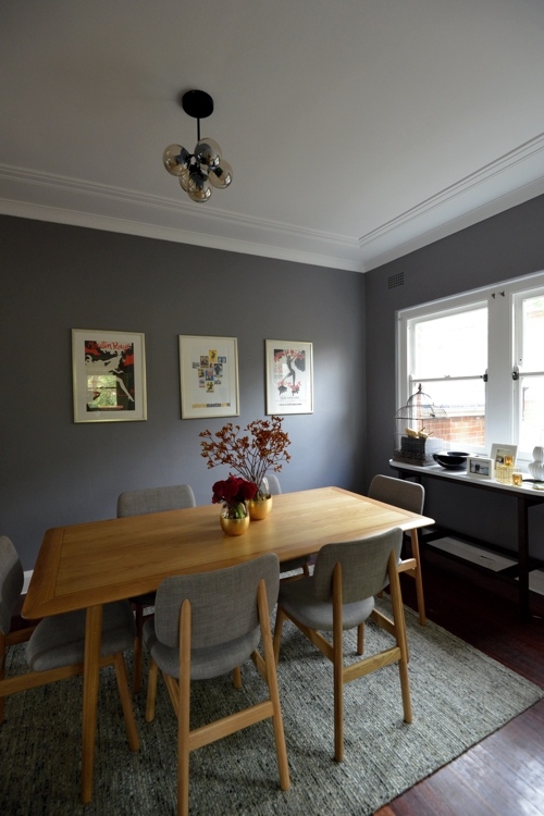
This was the toughest colour decision. We considered several colour options before committing as initially we thought it would be too much of a leap and settled for a lighter hue. After painting one wall we reverted, and we’re so glad we did. The ‘Antique Grey’ creates a sense of sophisticated drama and the metals that we love really pop against the dark. It’s a perfect backdrop for the smokey pendant lighting.
We decided to choose an oak style table as wood provides a character of warmth – doesn’t it ask to be felt and touched? It’s also child-friendly with no hard corners. A lighter tabletop contrasts well from the darker wooden floors and rug, and compliments our scant golden pieces.
Gathering around the table for a meal with loved ones is really important and a special time of day. We’re looking forward to having people over for a good meal or two during the festive season (there’ll be platters of fresh seafood, generous cheese boards, and some good wine and whisky).
Wall colour: Taubmans Antique Silver and Platonic White in Low Sheen
Windows, Doors and Trim colour: Crisp White
Styling notes: Modo Glass 5-Globe pendant light, Larsson dining table and chairs and Erskine floor rug by Freedom.
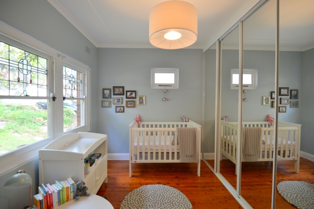
Nursery Room
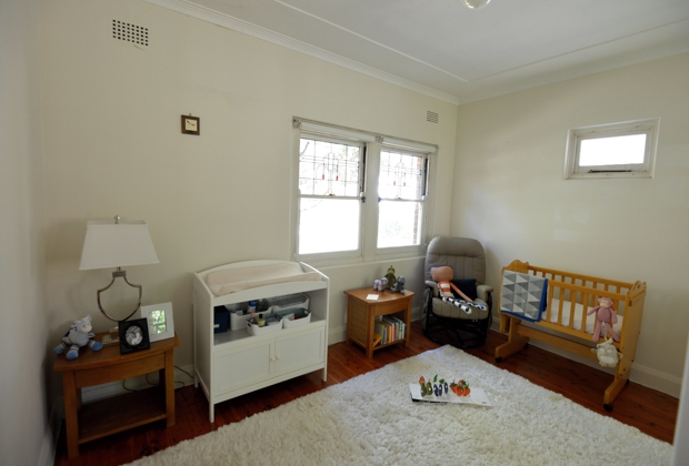
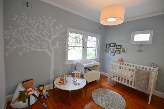
The nursery has us smitten. It comes as little surprise as we’re enamoured with both the wall colour and our little boy who we’ll be spending much time together with here.
We wanted a non-gender specific theme and were recommended a green/grey hue to compliment the white nursery furniture. The colour creates a clean, refreshing and calming mood accentuated by the pop of bright toys. It won’t always look this tidy so more storage options will be introduced in the near future. By only covering two walls with colour the nursery has a nice contrast when the sunlight bounces in.
What’s not to love about Olli Ella’s Moondrop rug with its kaleidoscope of aqua, a splash of ecru, a hint of white and a dash of warm musk? The group of photo frames were found at a framing warehouse on the recent Garage Sale Trail, the white tree plus owl decal on eBay.
Wall colour: Taubmans ‘Grey Attitude’ and ‘Crisp White’ in Low Sheen
Windows, Doors and Trim colour: Taubmans Crisp White
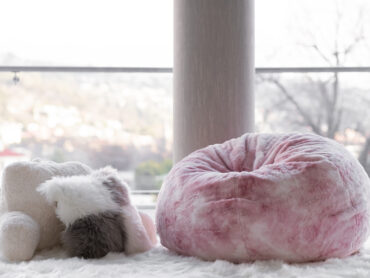
Styling notes: Boori nursery furniture, Moondrop rug and Poppet little bean bag Olli Ella, monogrammed baby blanket Pottery Barn Kids.
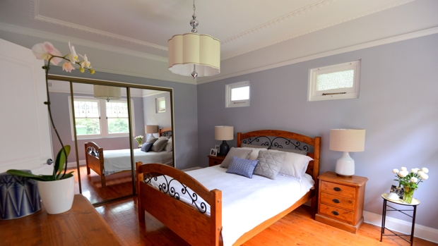
Bedroom
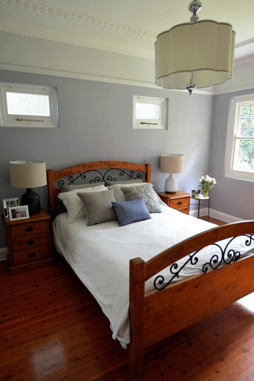
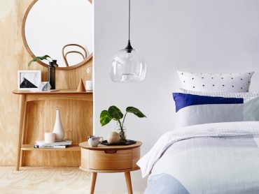
A place of private solitude and rest (and no technology), we kept the bedroom clean and understated with soft pendant lighting and bedside lamps for reading.
The walls feature a silver based grey, platonic white to crisp white. We are careful not to go too dark but enough to give it a real hint of excitement, whereas the whites give strength and energy to the room. Eventually we’ll include a serene piece of wall art.
Wall colour: Taubmans ‘Hi Ho Silver’ and ‘Platonic White’ in Low Sheen
Windows, Doors and Trim colour: Taubmans Crisp White
We created our new look in one fell swoop and added pieces acquired over a period of time to give our home our individual stamp. More pieces will be added as we accumulate life experiences and our family grows.
By painting with a new colour scheme, we injected a breath of fresh air into our interiors. Embracing colour seems like a leap into the unknown, but by understanding how colour works and following just a few simple colour rules, we felt more confident in selecting the right hue for our space.
Thinking about starting your own painting project? Find out how to choose your colours here and learn about top painting tips here.
This message is sponsored by #ColourMyRoom instigators Taubmans
